

If you have not seen Pixar's "Up" yet, all I can say is that you are in for an artistic treat.
Lou Romano, one of the films production designers from 2005 to 2008, has dedicated a fascinating and lengthy post about Up's artistic direction on his blog. It is incredible to see the amount of work that goes into this type of animated feature.
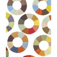
Without giving too much away, the illustrations above were done after a research trip the Pixar team took to South America. The point of the drawings was to convey the feeling and style of the proposed film. To me, it has a mid-century, Miroslav Sasek vibe. It's almost a shame that these are just for experimental, pre-production purposes since they are so beautiful. However, the second illustration did secure a spot in the finished movie as the mural Ellie paints above the mantel.
Hope you enjoy the film as much as I did. (Take a Kleenex).


5 comments:
that looks so cool. kind of sort of like a dr suess book i have that... you know the one with artist illustrations about moods being colors. excuse my absent mindedness, i've not had my first coffee yet! so seeing this is now on my to-do while in america list. how's it going with the garden????
My friend just saw this one yesterday! It is a must see .... I am told!
Leslie
Oh, I adore this post! We're taking our pre-teen daughter (and a bunch of her pals) to see UP next week for her birthday celebration. I told her about your advice to 'take a Kleenex.' Might I have a group meltdown on my hands?
Lou Romano's site is wonderful. I wouldn't have known about it without your post.
(As ever, I appreciate the Miroslav Sasek nod.)
Love it all!
This post makes me want to see "Up" even MORE. Great stuff!
cried my eyes out, still crying even after i got out of the movie. sad in the beginning, so heartwarming at the end. best pixar flick yet!
Post a Comment