The question is not which one has the better stylist, it's which one has the better "photoshop retoucher". Moisturiser doesn't take away the wrinkles, but Gaussian blur and the clone tool sure do.
I actually like the Tods ad. I find it kind refreshingly retro... the estee ad makes me think she could be any old model retouched. Part of the charm, for me, is that you know it's her, even if she's not looking like a young model. It's kind of recalls the Talented Mr.Ripley?
 One Magazine.


11 comments:
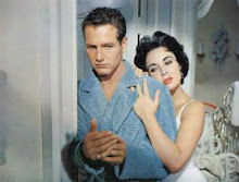
the one on the right. is it for tod's?
Yes, but I am going with the one on the left.
you're back - fantastic!
Definitely the one on the left...I am so tired of those Tod's adds, is it just me or does Gwyneth look 10yrs older in those...?
The question is not which one has the better stylist, it's which one has the better "photoshop retoucher". Moisturiser doesn't take away the wrinkles, but Gaussian blur and the clone tool sure do.
Great point Pieter. Yes, I should have said "which art department are you going with?"
Thanks Suzy. I totally agree. Tod's maybe going for "classic", but the look is beyond her years.
I actually like the Tods ad. I find it kind refreshingly retro... the estee ad makes me think she could be any old model retouched. Part of the charm, for me, is that you know it's her, even if she's not looking like a young model. It's kind of recalls the Talented Mr.Ripley?
both. she is gorgeous! i love her hair :)
Definitely Estee Lauder's.
Gwyneth looks like a burnt out soccer mom in Tod's.
So glad your back!!
She look's like Grace Kelly in the Tod's ad...and who doesn't love that?
Tods for me. The other makes her look vampish and too made up. Not a great choice for a cosmetic ad.
Post a Comment