
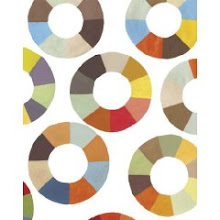
 This month's edition of Elle Decor was so full of beautiful images that I almost missed this small photograph of a large painting by one of my favorite Atlanta artists, Carolyn Carr. The palette for the East Hampton home was designed with the painting's hues in mind...
 The colors remind me of that moment when the surf meets the sand. More images from the portfolio of East Hampton interior designer, Robert Stilin can be seen here.


3 comments:
I love the work of Carr, and this painting is particularly beautiful. I have a fondness for the painting to match the decor - I can't help it!
I know what you mean. I was not sure from the wording in the article which came first--the palette or the painting. But, I think this is such a natural and soothing color composition for a beach house. Either way, it works for me.
Hi, love your blog:)
I did a post on some of your amazing posts. Thanks for sharing&keep it up.
Come visit sometime:
http://live-yourstyle.blogspot.com/2009/05/brilliant-asylum-in-yellow.html
Post a Comment