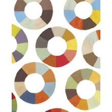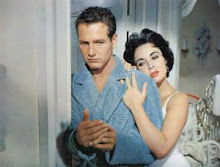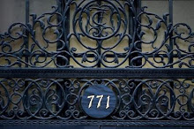


 (Photos 1 and 3 = Eddie Ross, Photos 2 and 4 = Pottery Barn)
 I know Eddie Ross did not invent the painted secretary or hutch crammed with creamware, but he has been a design star lately and I think we can credit him with reinvigorating the New England approach to decorating. Of course Pottery Barn is obviously lacking Eddie's personality and styling, but even the chair "artwork" in the catalog reminded me of one of his recent decoupage projects.
Pink Wallpaper did a great post back in January about the Pottery Barn designer knock-off phenomenon. What do you think--is Pottery Barn poaching off of the designers or just being inspired?


28 comments:
Since Eddie's personality does not shine in my book, I have a very hard time respecting his work. Yes, he is talented in the "New England" way you described, but that is about all he has going for him. Maybe Martha will wake up from her coma and get rid of the pompous jerk!
He definitely elicits an emotional response from people, but I find his egomania oddly endearing.
I loved Eddie Ross on the show, he added personality. Some of his work was amazing, a couple things were not so great......like all the contestants left on the show. But in Pottery Barn's defense, weren't those catalog shots done months ago, pre-Top Design season 2?
Very interesting. There really are quite a few similarities.
I can agree with oddly endearing. however, his narcissistic behavior is not endearing.
S & G, This was the first time I had noticed any similarities, but you could be right--strange coincidence if so.
I am disappointed, Eddie Ross and endearing? Wake up, people, he is so rude and obnoxious.
I bought a similar secretary from Pottery Barn 2 years ago...
I agree, I find Eddie Ross's personality absolutely outrageous. His constant whining (This is a dump! This is disgusted! etc), all these snide looks and comments on other contestants, and complete disrespect toward judges (all of whom are far more accomplished than him). Adler said smth along the lines that he needs to calm down and eat some humble pie. Amen.
It's a shame not everyone can know Eddie personally as some of us do. Word to the wise: don't be fooled by everything you see on TV...hello editing and ratings. For instance, you don't know what an interviewer asked him to solicit some of his responses we saw in between the design challenges.
Besides his array of talents, Eddie's a very kind, energetic and colorful person to say the least. His grande personality + design skills made Top Design all the more interesting. How boring of a show would it have been without him?!?
I think it's very strange that Pottery Barn's things mirror his own projects so much. What a great observation!
I didn't watch enough Top Design to really get a sense of Eddie, but I love the projects on his blog because those are the things I like to do myself. I've seen him wear bow ties, which I think are kind of silly, but that's just a difference in our personal styles.
As for Pottery Barn, like anywhere else, it's hit and miss. Right behind me is a PB lamp that I love, but we have a pair of end tables that I'm ready to see go.
Millie -- those chair renderings remind me of the ones I found years ago and posted on my blog a few months back. I mean renderings are nothing new -- I just think it's interesting that I had them in the closet but recently brought them out. Collective design unconscious :)
Nice ornaments in your latest post.
I agree with Style and Grace - the PB catalog was shot months ago, so it's a coincidence. I thought PB's look was channeling Martha months ago. Or maybe it's just that both Eddie and PB have hit upon a new/old trend that is speaking to us in difficult economic times - reuse, recycle, the old ways of economy weren't bad, etc.
btw - yes, Eddie's personality on the show was terrible, but yes, much of it was in the editing. I interviewed him last week for a podcast on bloggingtopdesign.blogspot.com and he was quite lovely and he acknowledged that while he said some nasty things, he said a lot of nice things that weren't used on the show.
Interesting. You bring up valid points. I think PB looks at what is "chic" right now before it goes mainstream "chic". One way to do this is to watch up and coming designers.
It is VERY clear that some things have been knocked off, ex. Madeleine Weinreb and Robshaw. But in this case, perhaps it is just the styling that makes it look so similiar.
Um, I think Eddie's, um "style" is about ten steps BEHIND Pottery Barn, which really sums up about how original he is!
PS I LOATHE Eddie! I mean, he made a comment about "midgets" that equated him to Hitler in my eyes on the future challenge. He's got all the style of the Golden Girls. No wait, the Golden Girls had better style than Eddie! Yeah, I guess I really really abhor that guy. He's hateful and he uses the phrase "panty dropping chic" and thinks it sounds cool.
WOW that comparison is crazy - verbatim rip off. Nice job spotting their thievery.
Trust me everyone. I know and have worked with Eddie. He can claim whatever he wants, but they didn't "edit" the show to make him look the way he did. They captured his personality exactly as he is: arrogant with major delusions of grandeur...that is unless he's kissing you up for something. Granted he's a talented stylist with a certain fussy look (not a designer) but that's the extent of it. I could add more, but will stop here. As for the Pottery Barn question....they developed that catalog months and months ago...long before Eddie did his Martha look on the show.
Very interesting.
Totally agree, Thanks for sharing such a nice post. Truely involving...
Please keep up the good work. Appreicate you efforts for sharing.
I am sure every one who check outs this blog loves the way the post is presented. I can't live without posting a comment on it. Every thing is nicely placed, well planned theme, Truly catching.
wonderful post
I find it difficult to add comments in the presence of praising commments. But one thing for sure the Post's awesome.
Waaaoooo great,
But frankly speaking the post's great. Really contributing to knowledge. Keep on sharing good ideas...!
If you get the idea and tracked it down do let us know about your findings.
Hmmmm.....for some reason Not so good for the little ones....but VERY good for the adults!
The post give a look classic in modern back ground. But even then every thing seems fit in well.
Excellent post and Really good information your post.
Bulk SMS Service Providers Hyderabad
Post a Comment